 Product Designer
Do you know what “tool compound”, “target expression” or “IC50” means? If not, that’s ok, when I started Benevolent as a Product Designer, I didn’t know either. That’s why I work with expert users: our drug discoverers.
They help with understanding the domain and, more importantly, they help to shape digital product requirements. At Benevolent, all of our products are co-created through close collaboration between technologists and scientists. Why? Because it is impossible to design a good product without knowing and understanding your users' needs. As a Product Designer at BenevolentAI, my role is to advance the design, usability, and utility of the user-facing aspects of our end-to-end AI drug discovery platform. My ultimate objective is to design digital products that enhance scientific research at different stages of the drug discovery process.
In order to fulfil this objective, our products must first satisfy some very unique scientific requirements. For example, the users of our Platform deal with a lot of information. This information may form a coherent picture about one segment of biology in question, or it may present conflicting or contradicting evidence. This is because biology is incredibly complex and is still poorly understood, meaning biomedical data is equally complex and incomplete. Therefore, new software products for AI-enabled drug discovery need to enable our scientists to navigate this complex data space in order to make unbiased, better informed, data-driven decisions.
We meet this challenging design brief by calling in our closest allies: our internal users (BenevolentAI’s scientists)
At BenevolentAI, I both closely collaborate with Product Managers and Software Engineers and work with different scientific experts, such as Drug Discoverers, Medicinal Chemists, Bioinformaticians, Cheminformaticians. Luckily, these users are also our colleagues, and we closely collaborate with them on a daily basis. They help me understand their thought process, their motivations, and their field of expertise; they are not only users but collaborators. By building this close relationship, I can, without having any scientific background, deliver designs that help them discover new and better drugs for patients in need.
Designing for, and collaborating with, expert users can be challenging. Here’s an outline of my design process to help other designers who find themselves designing products in a complex, collaborative scientific environment
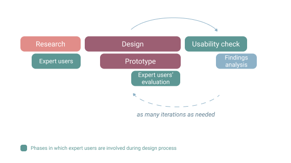
The first rule is not to panic, and to take design tasks step by step. That is ok to not know everything from the outset and it is ok, and even encouraged, to ask questions if you’re not sure. Scientists at Benevolent are passionate about their work and field of expertise and can communicate difficult topics in a way that others from outside their domain can understand. After all, no one at the company has all the answers, so we’re used to collaborating on solutions. With this in mind, we can embark on a 3 part process; research, design and consult, and check usability.

1. Research
Research in our design team is conducted by the user researcher, designers, and product managers; it depends on the scope and complexity of the project . On some projects, I perform the research, and on others, I use our researcher’s findings. One of my favorite research and empathy-building techniques is observation.
Since our users are in-house, we have this great opportunity to schedule one-hour sessions with our experts and observe how they use our products, how they work, what their challenges or pain points are etc. Such observation will help you make better-informed design decisions.
Another useful research method is user interviews - for example, I observe our user researcher conducting them and take notes. After the interviews, I receive a “Proposed requirements” document that helps me start working on the project. Sometimes I will watch the recording from the interviews again (if the domain is new to me), to get a feeling about who our users are.
If the project doesn’t require the user researcher’s attention, I conduct user interviews myself to uncover requirements. If the project is even smaller I organize only kick-off meetings where I could get the expert’s input and help me understand the topic. I always try to keep the pool of experts diverse to get a variety of points of view.
Sessions run during my onboarding process helped me learn about the drug discovery process, so I was accustomed to the domain of my users. It also always helps to read about the domain on your own to get some prior knowledge before starting talking to users.
When I collect the basic information about the topic and find out more about users’ pain points I start working on initial designs.
2. Design and consult
My design process consists of design and expert scientist evaluation. When needed, I get feedback from my domain expert colleagues to get a scientist’s perspective before I move on to evaluating my designs from a usability perspective.
Depending on the task I start with low-fidelity or high-fidelity designs. Regardless of the fidelity of my designs, I check them with experts and ask for feedback: is everything correct, is something missing? It’s important to do this before the usability check, because otherwise, scientists may focus on the details rather than the design, e.g. irregularities in dummy data instead of performing activities during the usability evaluation phase. I also try to spot any usability problems that users may have with the designs (however it is not a priority at this stage).
I try to keep the group of experts as diverse as possible and separate the experts taking part in the design process from the ones taking part in the usability checks; I want those in the latter group to see the designs for the first time when conducting usability checks.
The last part of the design process involves other stakeholders, such as Software Engineers or Product Managers to learn about different perspectives.
Designing, showing the prototype to users is an iterative process, and everything happens in parallel. Although I work closely with users I still need the fresh perspective of my primary users who weren’t involved in the project. That’s why I organize user testing sessions, or “usability checks”, to remove any implication that users are tested, not designs.
3. Usability checks with prototypes
The form of the usability check differs depending on the project.
- For smaller projects, I hold a briefing with users where I ask them to perform a few activities on the interactive prototype. Depending on how designs perform, I iterate on them.
- If I have time, I might also ask expert users for their feedback on the design. This is an opportunity to get new insights from domain experts who weren’t involved in the project earlier. The more people I ask, the more small details or requirements I can find that are missing. Because in the research phase I observed the users while they work, I can prioritize my findings better.
- For bigger projects, I hold longer usability check meetings.
- In case I need more input from a diverse group of users I set up a remote user testing session (using maze.design) allowing users, in their own time and terms, to participate in usability checks.
- When using Maze, I don’t have the opportunity to ask them about their expert input face to face, so I use it at the end of the process, or when the nature of the design is more into interaction design and doesn’t require much of the expert input.
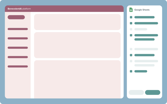
- In the case of complex interactions or hypotheses, I try to use interactive prototypes and check them in users' normal workflow. For one of the first large projects I had at BenevolentAI, I had to redesign a key flow in Drug Discoverers’ workflow. I had an idea about improving how Drug Discoverers collect their assessment about a gene, and I was interested in finding out how users would respond to this idea. The design wasn't as complex, but the new flow was different from what users are used to. The quickest and, frankly, the best solution was to use Google Sheets with pre-formatted functional cells which were arranged to simulate new product features. The prototype setup was BenevolentAI’s platform taking up 70% of user’s screens and on the right side, they had the Google Sheet prototype. In this way, users were able to enter real data into the proposed design and I was able to observe how they work with it, all of which cost very little from the prototyping perspective.

Example
I was looking for interactivity and the possibility of accepting user input that this prototype provided compared to other quick and easily accessible prototyping tools. Thanks to this approach, with few cycles of usability checks I could: quickly and efficiently confirm my hypothesis, see how users react to the new flow and find potential issues with the design.
If necessary (if I’ve noticed some usability issues with the design or something was misleading in the design etc) I redesign and repeat usability checks.
Described above are the 3 main steps in my design for and with the experts. It is a highly interactive process, details of which vary depending on the project, users, timeline, and implementation.
Working at a company with such a highly scientific business domain is challenging for designers without a science background. Constant collaboration with our users is extremely valuable in our design process and helps us design successful visualizations, dashboards, or design tools in the drug discovery domain.
Back to blog post and videos


